Identity Collage Portrait


|
Over the course of the two weeks I was working on this piece of art I always gave myself a goal. I stayed a little bit after class and came in after school to work on this as well. I never settled for doing less; I always wanted to go further with this project.
The photo that I chose to use was one of the senior photos that I took over the summer. The photo is of me in a park next to some shrubbery and trees. I chose to make the background green because it matched the background of the photo very well and it also was a complementary color to most of the symbolic images I have displayed. The symbolic images that I have used, I feel, represents me and my interests. I have three images of coffee/tea on my artwork because I am a coffee/tea connoisseur. I also have chosen to put on a Pepsi bottle cap to show I also like pop. I also have two depictions of food. The two foods being pizza and Goldfish. I have placed these on here because I like food and all types of food. I also have two cats on my artwork as well. This is to show that I love cats and I actually own cats of my own. I also have an image of a diffuser on my art because I actually own a diffuser and I like the way I can make my room smell and the energy it can give a room. The words that I have decided to put on my artwork are self-explanatory. The words such as funny, fun, fresh, art, and rich are all words that representative of my personality, but some words do need extra explanation. The word tea has a double purpose. Tea in today's terms could also be called drama or gossip. I use the word to represent today's definition, but I also use it because I like to drink tea. The last word that needs more explanation is the word extra. I use the word extra to define myself. People have always told me “oh you are so extra” which means that a person will go to greater lengths to which you need to go. Towards the end of the project I had wanted to come into class with fresh eyes and say “what can I further improve upon”. For my eyes I had thought that I would be able to use a models eyes from a magazine, but towards the end I realized that they were not good. They looked very dull and pale, so I put on new eyes that I had made myself so they did not look dull and so the eyes would stand out more. It was also hard for me to look at the mouth in the beginning of the project. My mouth didn't look like it was smiling at all like in the picture, but towards the end the smile came together just fine. The teeth were also a huge obstacle for me, so I got some help from my teacher and she gave me some techniques that were beneficial for my smile. Overall the project was a huge success in my eyes. I went into this open minded and I just saw what happened and it just all came together. I couldn't be more proud of myself and the art I produced. |
Real Anatomy of Technology

|
These photos to the left and right were used to help aid me in the process of making this project. The color swatch book (left) is what I used to determine what would be the best color choice for my piece. The sketch book (right) was just a preliminary sketch to what I was going to do for the finished piece.
|

|
In this art assignment I was given the task of drawing the real anatomy of a piece of technology. For this piece we were asked to draw this image on a piece of paper. We as a class were supposed to using shading and blending techniques to achieve a semi-realistic effect.
My piece depicts a girl sitting in the corner alone that is dark and gloomy. The people that are walking away are apps. These apps are all possessing something that can be classified as negative for that app. You have Instagram we're the app is shown holding a bat to bash people, Facebook like and dislike buttons, YouTube with the app holding the word canceled, and Snapchat showing screenshot and received. There are also bars at the top of the walls to show that she is being held in a mental prison in which she is unable to escape. She is unable to escape this negative mind because she is bring herself and holding herself there.
I myself grew up in a time were Iphones were not a thing yet. I can definitely say that having my phone that I have now has caused more trouble than I thought it could. Social media has caused this effect were if you do one minor slip up then you will be ridiculed and “canceled” by other people. My mother however, grew up in a time were people were still using the landlines. My mother said that there wasn't much cyber-bullying, but that doesn't dismiss that there wasn't bullying in general.
The power that social media has on people is very damaging to some people. Influencers and other people are held to this statute that we are supposed to be the best at all times of our life, but it is impossible to be perfect. So don’t let media hold you in a mental prison and make sure that you use the internet responsibly. It is something of a luxury, but that luxury can turn against you.
The Value of Words
When told that this assignment can potentially hold very powerful meaning/ message. Immediately I thought of my friend, Mia. Mia and I have our own separate project that we are doing independently were we are taking a photo of ourselves everyday throughout high school. The photo that I had chosen for this assignment was one of these photos. The photo is of me holding a floor fan and Mia holding a recycling bin. This was also one of the first photos that we did together for our project. The room that we are standing in the photo is one of our teachers rooms. This photo holds a lot of meaning to me, because I love doing these with Mia. These silly photos that we do make use laugh, and other teachers and staff enjoy the photos as well. Going into this project with the idea of using words to make art is strange. Being able to convey depth with only using words is tricky. However, I do think using words is a good way to represent people and who the artist perceive them. Artist can put words that describe themselves and other people in their life. I used this project to take about how I think this project is making my friendship stronger and how grateful I am with our teacher for putting up with us. I feel as though I have been able to convey my feelings and thought about this side project Mia and I are working on, our silly side, and the gratitude I have towards other teachers and staff. This project has meant a lot to me and I hope that this project will mean something for other people as well.
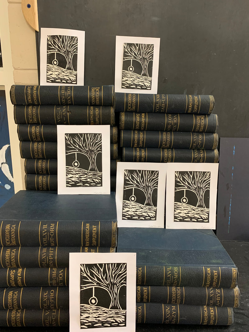
Print Making
|
For this assignment, I never had a specific idea in mind when trying to make a print. I had tried doing a test print before my final prints. I had wanted to test the mat to see how using the tools were going to cut and how deep I was going to have to cut. I realized right away that it was very difficult to cut all the extra mat around my design. I also realized from my test that I was not going to want to letters. I am not at a level where I feel like I could do letters very well. The final product that I ended up with was really great. The field in my final print was something that I especially liked. I feel as though I was able to make a great gradient with different tools and sizes to make a great design. The picture that I had taken doesn't show the cards in full detail. The ink that we had used had created some issues. The ink that we used for our cards was a very high quality ink, but this was our teachers first time using said ink. The ink had created smudging on some of the cards. Even after spraying the cards with a sealant that could have potentially helped did not work. I was disappointed by this fact, but there was nothing that me or my teacher could fix. Overall, this was a very fun assignment to do. My print ended coming out very good. The printing process was very hard as well to try and make six identical prints as well.
|
|
Art for Activism
|
For this assignment, my class was assigned to do a piece that talks about a current real word issue. My end result ended up being a multi-media, sculpture piece. I chose to talk about the mistreatment of the LGBTQ+ community. This is a huge issue that I think needs to be talked about. I, myself, am part of this very large community and have been subject to this kind of mistreatment.
I pulled in different pieces to make this look visually unique and give a realistic view of this issue. My finished piece (right) just shows the process of the assembly of the project and making it come to fruition. |
|

This is the finished piece after it was all assembled. I think that the project couldn't have turned out any better. The 3-D visuals that I included in this make this piece really pop.

This piece of the sculpture depicts a man reaching towards a balloon that he will never be able to reach. The chains on this piece are also attached to his feet anchored at the base of the project.

The balloon represents the words that describe the LGBTQ+ community. The balloon is also shown to be flying away because people in the LGBTQ+ will never have the chance to reach it if they are being weighed down by the chains and words shown on the anchor.

This is the board that the whole project is attached to. This board shows words that people have told people in the LGBTQ+ community throughout the years. These words have a lot of weight to them as these words are put on the anchors and the base of the board.
